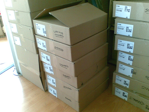
Blimey, I’m getting name-checked on other people’s Boomkat reviews now!
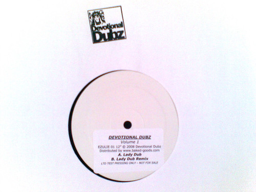
ZOMBY, Liquid Dancehall / Strange Fruit – Boomkat
‘Liquid Dancehall’ occupies the A-side with a techno-insistent slab of dubstep bass science, still definitely one for the rudeboy crew but formatted into a brutally minimal and linear structure with a 3:2 time signature hailing the onset of the forthcoming ragga techno invasion spearheaded by Grievous Angel and TRG amongst others, definitely a direction we like to see things headed.
This is a GOOD TUNE so big up Zomby. I’d have liked to have made it.
There’s a strong beat but it’s not THAT 3:2-ish, it’s more skippy sub-4×4 with the snare on the third beat. I like it a lot – i should do more stuff like that on the more straight ahead dubstep tracks. And of course it’s a lot like Benga’s gear which is always a good thing. But proper ragga techno has a proper ragga MC on it – hard to find but it’s great when you do!